
The Functionalist Chaos Behind the EP Release
On Friday, June 12, we are releasing our new EP. It is titled Press to Descend EP, and to us, it marks the culmination of an intense, thrilling 2026.
The EP brings together the three singles we have shared throughout the year: The New Failure, Forget Technology, and Travel Alone. But to complete the sonic picture, we also recorded two brand-new tracks that we feel capture where we are right now, both musically and philosophically.
The first new track is “Club General Kindness”. A nerdy, philosophical revolt against the cynical, cold reputation of modern nightlife, it explores the dancefloor as a scene for genuine empathy and human connection. Musically, it is a raw, minimal electroclash track driven by a hypnotic, warm bassline under mechanical drum machine beats.
The title track, “Press to Descend”, is its dark twin. It is a more cinematic march that channels both classic synthwave and EBM. With deep, echoing vocals and a driving rhythmic pulse, the track feels like a literal elevator ride down into a neon-lit, underground club landscape. It’s a musical surrender to the comfort of dark melancholy.
Design Choices From Bauhaus to “Blåvitt”
The process of giving this collection of songs a unified visual identity has been a long journey. Because the three previously released singles each had wildly different, chaotic visual expressions, we felt an urgent need for the EP to have a neutral, functional counterweight. We wanted an identity where form strictly follows function.
Our collaborative moodboard became a beautifully eclectic space. We studied the rigid lines of the Bauhaus movement, analyzed the clean typography on vintage cigarette packaging, and channeled the bold, high-energy green aesthetics of Charli XCX’s Brat. We even found ourselves philosophically debating the iconic, minimalist “Blåvitt” (Blue and White) generic branding used by Swedish grocery cooperative Konsum in the 1970s and 80s. There is something profoundly honest about design that refuses to sell itself through cheap tricks, choosing instead to simply declare exactly what it contains.
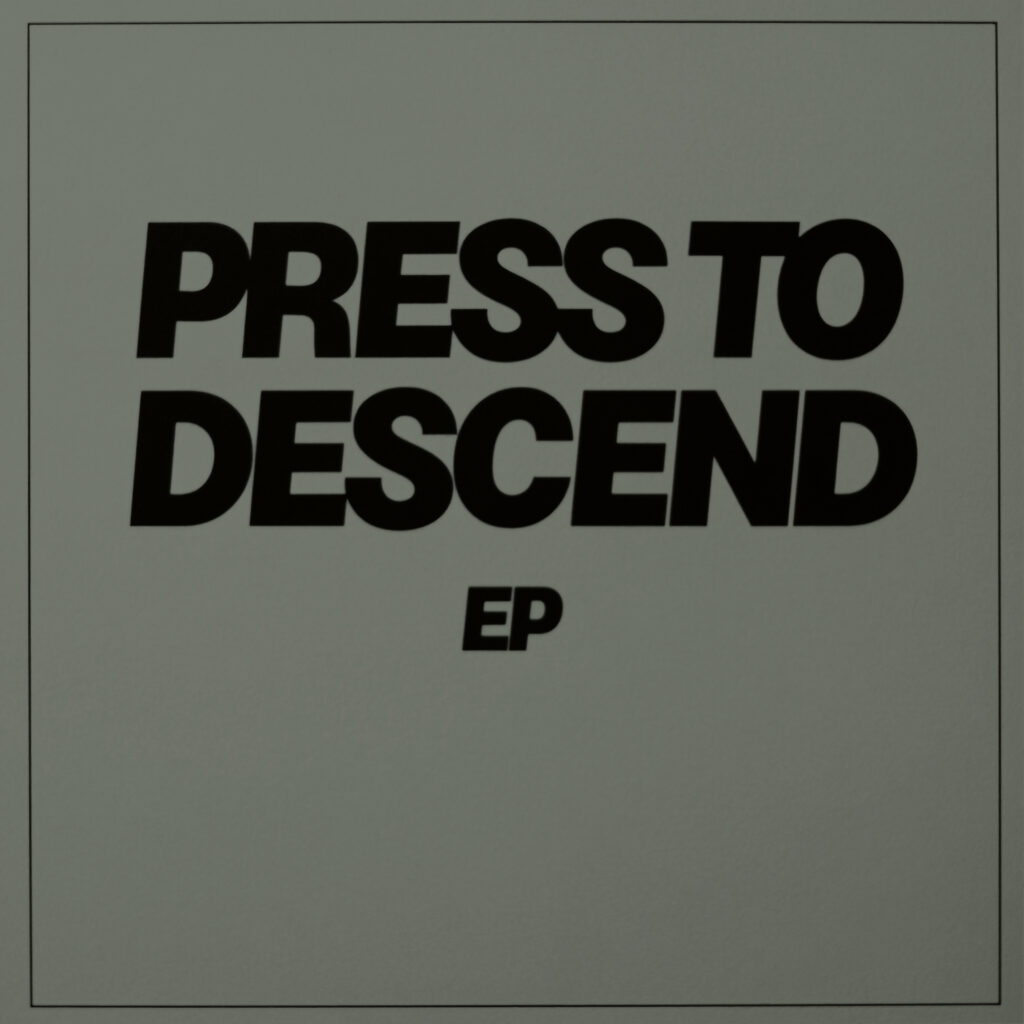
The cover art we finally chose is, therefore, stripped of all noise. The title is set entirely in stark, uppercase block letters. No decoration. No clutter. Just the music and the name.
However, the creative detour wasn’t for nothing. Along the way, we generated a series of alternative sketch versions—some more chaotic, others even more starkly minimalist. We have archived the best of these iterations, and they will be integrated into our merchandise and across this website in the near future as part of the expanding Futuro visual universe.
Get ready to press the button. We descend on June 12.
Release ID: FUT-2026-001
Format: Digital EP / Stereo / 24-bit WAV
Components: 3 Catalog Singles, 2 New Contextual Masters
Visual SchemE: Functionalist Minimal / Monochrome / Sans-Serif Bold Block Typography
Source Materials: Sub-level production sketches archived for upcoming Merch Drop 01.